TCG Devlog #4 – What Makes a Card Feel Magical?
My deep dive into the designs of Pokémon, Magic: The Gathering, and Hearthstone

Pokémon, Magic: The Gathering, and Hearthstone have all perfected different aspects—collectibility, strategic depth, and gameplay clarity. But what are the key ingredients and pitfalls that can inform my card design?
YouTube video of my thoughts here or continue reading for the written breakdown.
Refining the Cards
As a solo dev, I have to be smart about where I put my time. This week, I spent a day refining two key elements of the cards:
Adding a Frame – In digital play, cards need a border for clarity against the background. Borders also distinguish common cards from legendary full-art cards.
Repositioning the Mana Symbol – Moving it to the top-left improves visibility in both digital and physical formats.
Lessons from Top TCGs
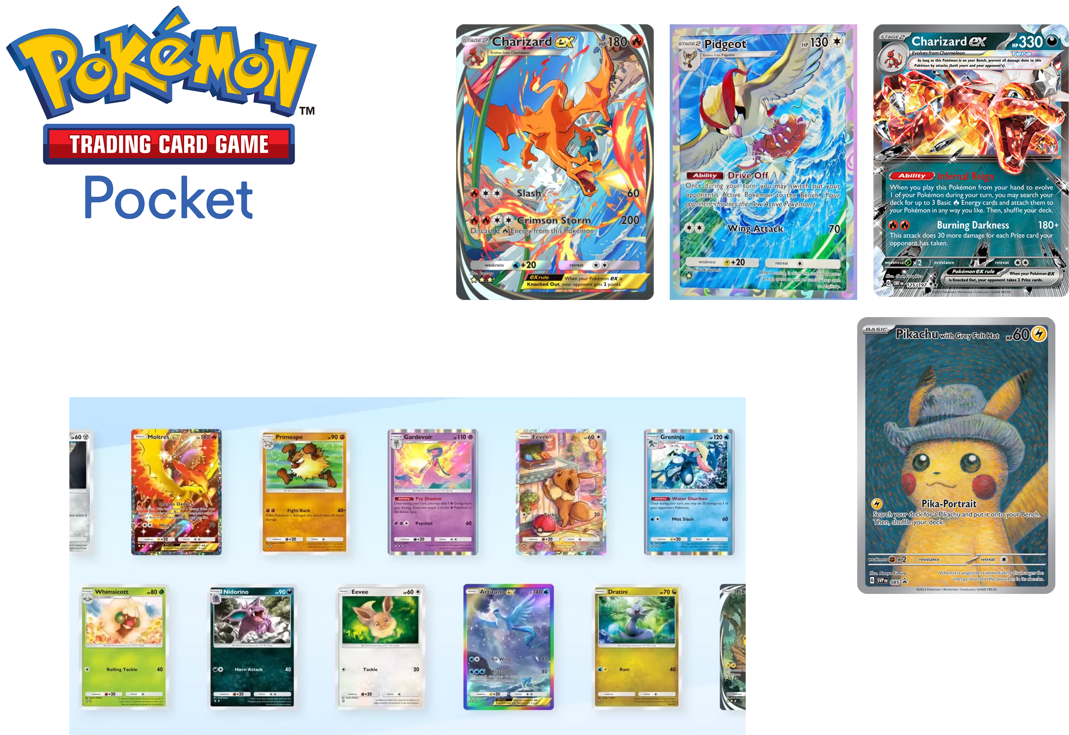
Pokémon: Collectibility & Vibrancy
✅ Highly collectible – Vibrant colors make each card feel unique and desirable.
✅ Instant recognition – Even non-players can visually distinguish cards.
✅ Broad appeal – Works for kids and collectors alike.
❌ Not suited for mature themes – Bright colors wouldn’t work for my project’s darker, mythic style.
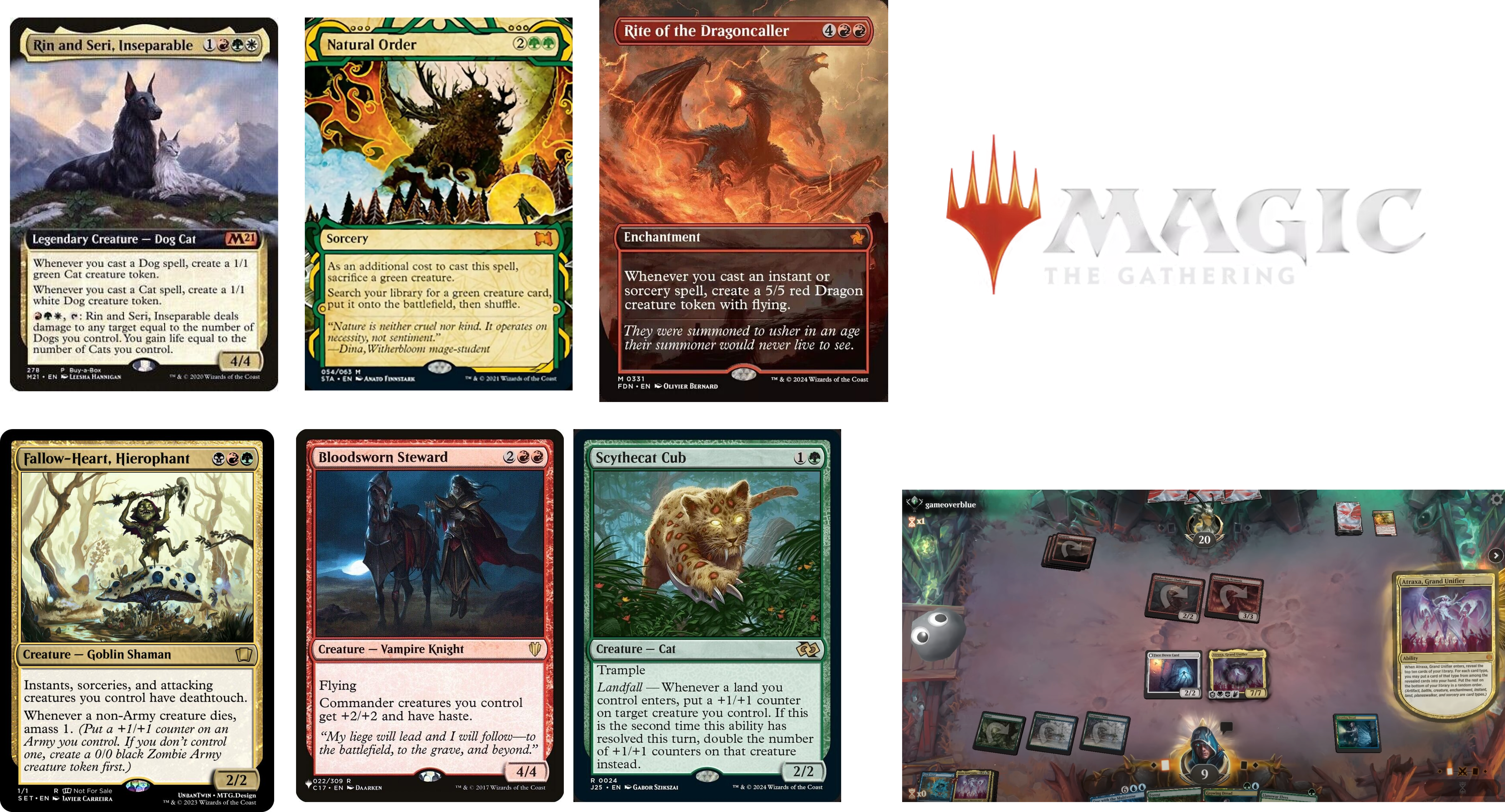
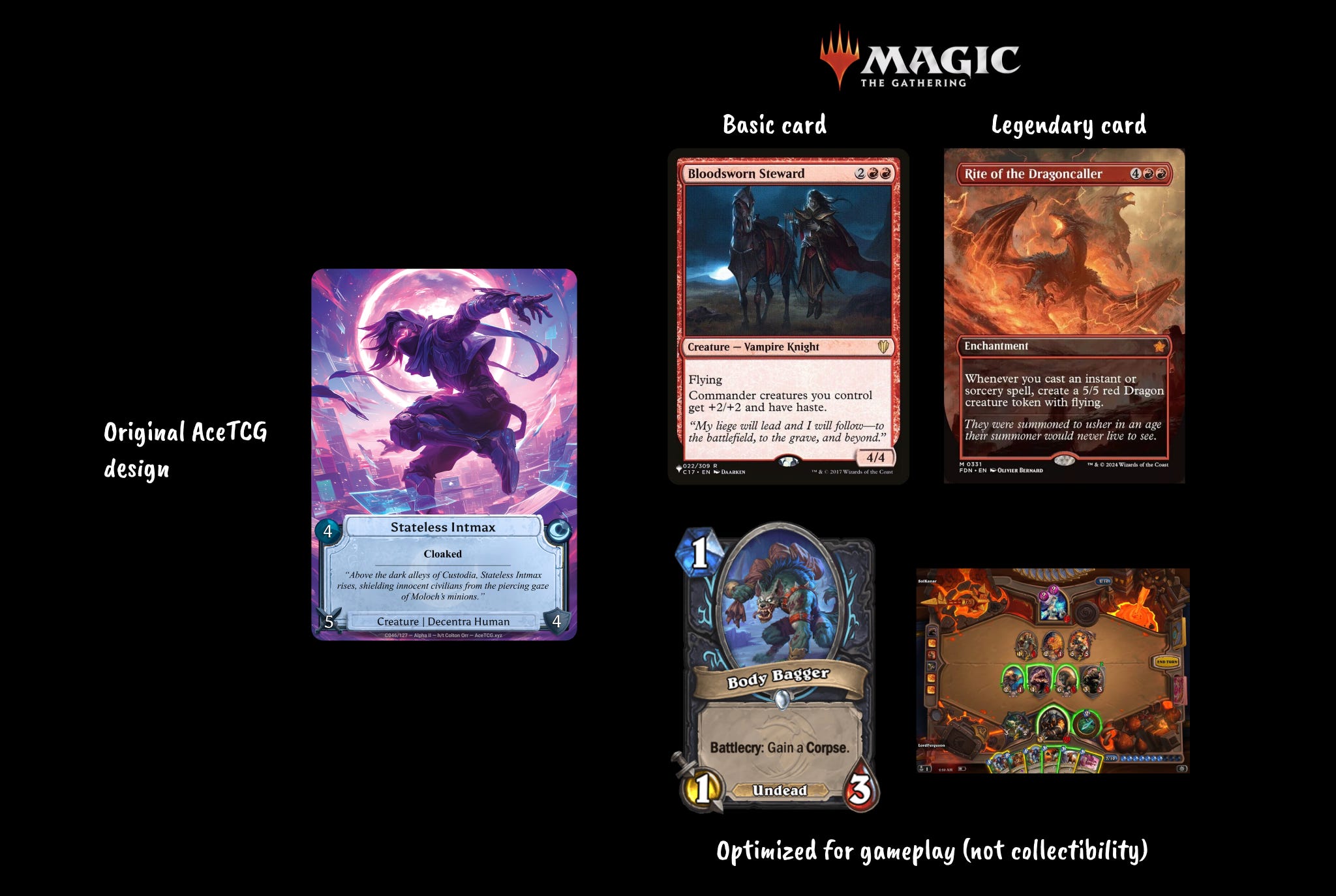
Magic: The Gathering: Timeless Strategy & Immersion
✅ Mature, spellbook aesthetic – Cards feel like pages from an ancient spellbook.
✅ Focus on detailed abilities – Art remains secondary; complex gameplay text is the focus.
❌ Tiny attack/defense values – Not optimized for accessibility.
❌ Less visually exciting for collectors – Small window for artwork :(
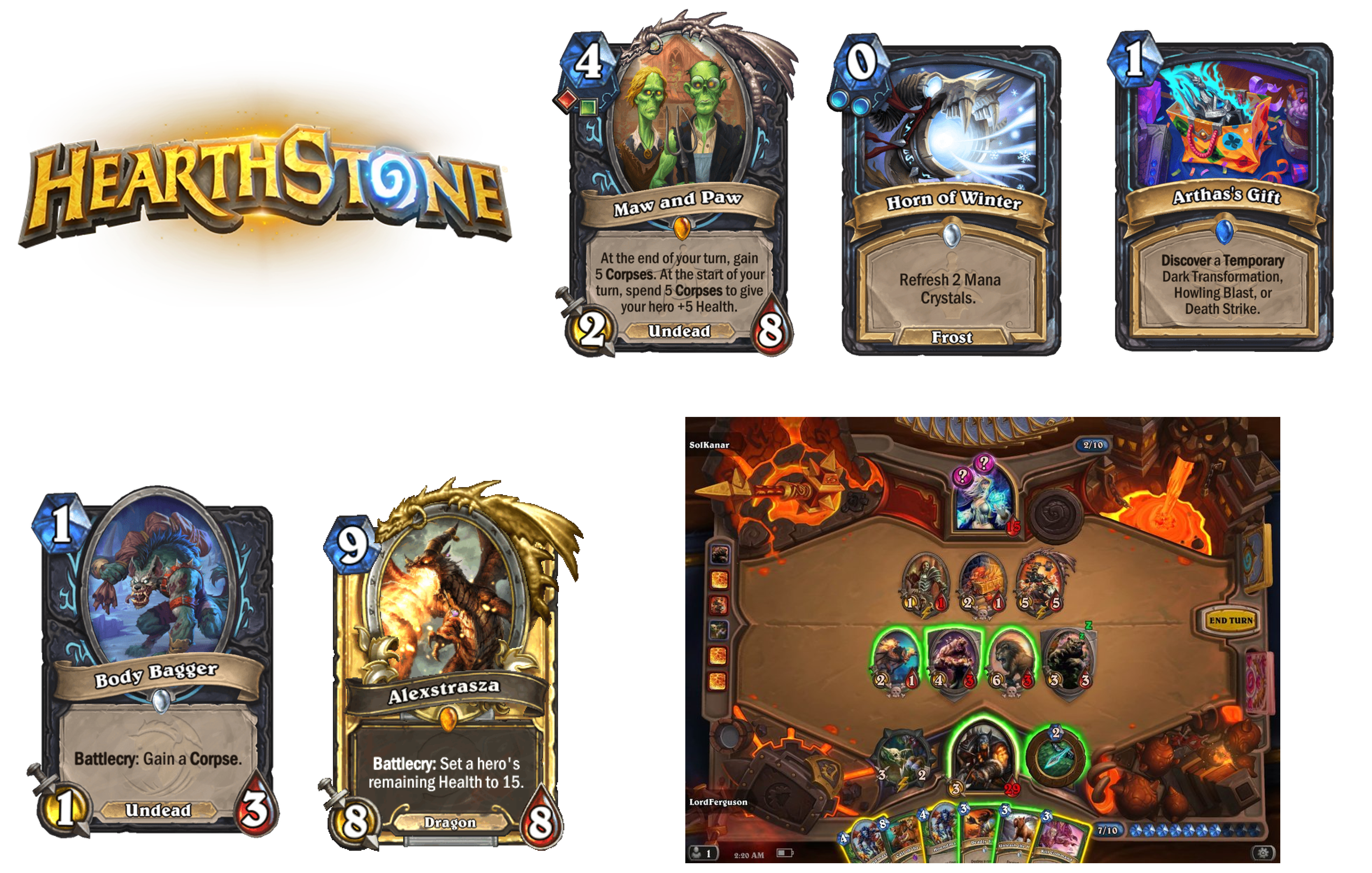
Hearthstone: Gameplay Optimization
✅ Ultra-readable – Big numbers, bold fonts, and high contrast make cards easy to scan.
✅ Designed for digital play – Cards transform when played, simplifying the board state.
✅ Hand-painted aesthetic – Beautiful stylization, though less suited for realism.
❌ Art takes a backseat – UI prioritizes gameplay, limiting how much artwork shines.
❌ Digital-first focus – Built for online play, but less appealing for collectors.
Where the Cards Are Headed
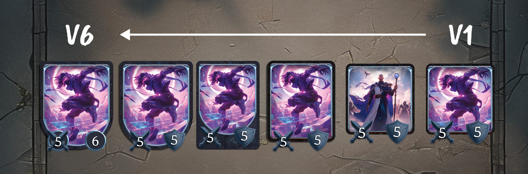
... the first version of the card on the board looked underwhelming (far-right example).
The updated design blends MTG’s structured layout with Hearthstone’s hand-painted aesthetic—though more refined and sleek.
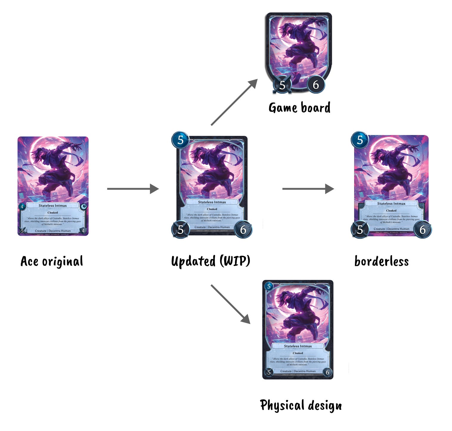
Additional elements:
Adding a thin border – Retains sleekness while improving structure for digital play.
Mana in the top-left – Boosts visibility. Mana, Attack, and Health are resized for clarity on digital cards.
Curved bottom design – Unique shape for board placement, inspired by Hearthstone’s transitions between hand and board cards.
Minimalist color accents – Enhances collectibility without overpowering the artwork.
Your Thoughts?
I may want to differentiate spells more. This Legends of Runeterra example shows how Units and Spells are visually distinct, with spells using a circular frame:
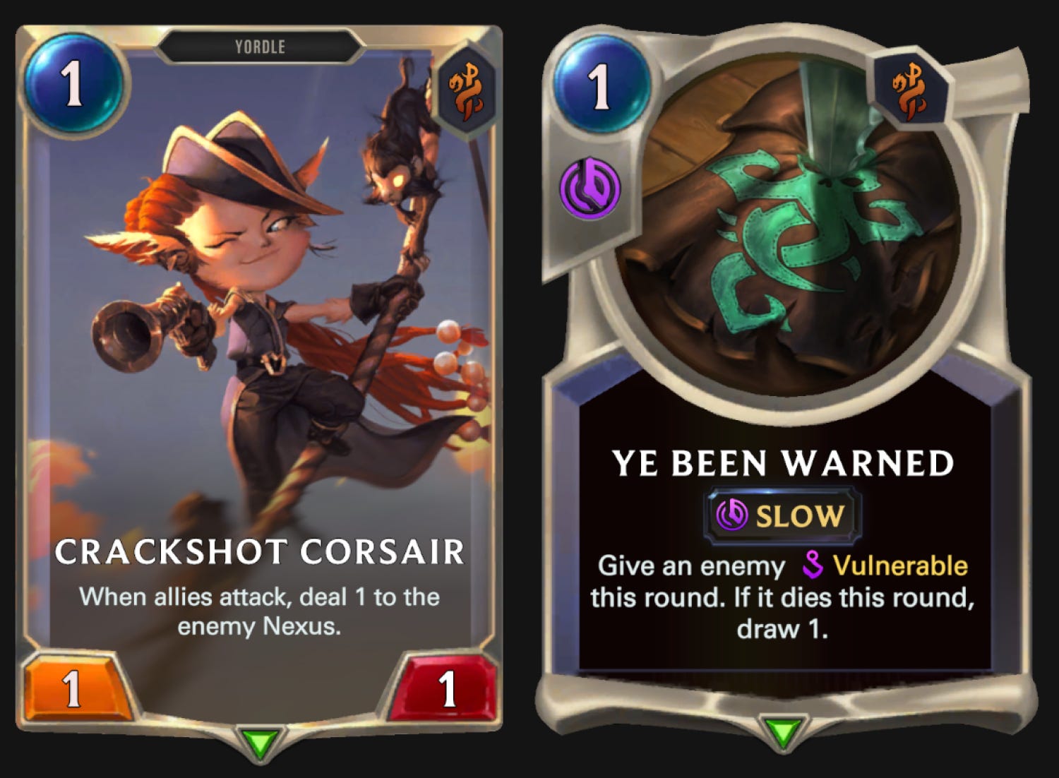
However, this approach crops the art significantly. MTG Arena takes a much subtler approach, differentiating spells and creatures through a curved shape on the bottom of the spell card.
In AceTCG, I used dark vs. light text boxes for this distinction. Given my time constraints, one elegant frame is enough for now :)
What are your favorite TCG designs?
How do you feel about this design direction? And lmk if you want to see more devlog videos like this.
Drop a comment and let’s nerd out on card aesthetics!
Shoutout to my wonderful girlfriend for offering her creative input on this!
With metta,
Colton